Jag hittar saker.
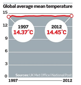
"What the graphs do not show is the actual level of global temperature, as it is measured above freezing point. In other words, they leave out by far the greater part of the total picture.
So the respected Canadian environmental writer, Lawrence Solomon, recently had the bright idea of publishing in his Financial Post newspaper column a graph showing the temperature changes of the past 15 years in proper perspective, using figures from the most prestigious of all official temperature records, compiled by the UK Met Office and its Hadley Centre."


